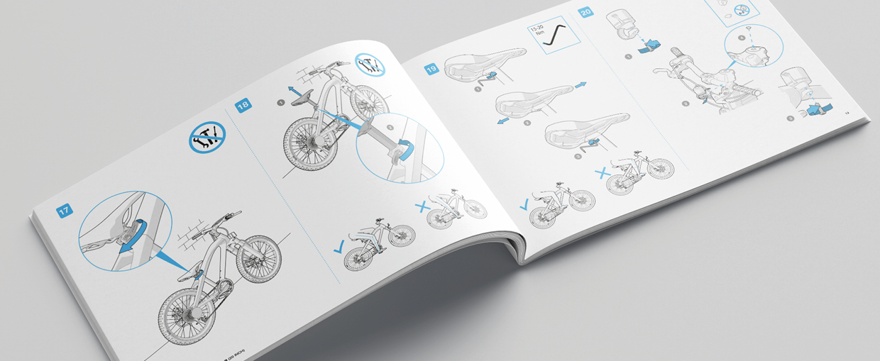
A picture should be goal-oriented
Always look at it from the perspective of the user. What message should the user receive? Should he gain an overall view, localise a certain section, be warned about the threat of a risk, etc.? Or what is the objective of the illustration? – that is the most important starting point.
A picture should be simple
A user does not want to be confronted by a puzzle; he should be able to comprehend the illustration at a glance:
- Leave out all unnecessary details.
- Do not use any symbols the user is (still) unfamiliar with. If it is necessary to explain an illustration, it is probably too complex!
- If you use several illustrations of the same object, make them as uniform as possible; use the same drawing style, do not use unnecessary changes in perspective or any unnecessary differences in the scale.
- Illustrate processes and procedures in the natural reading direction: from left to right and from top to bottom.
- Try not to be (too) original. Use conventional symbols.
The Position of Captions
In a technical manual it is often necessary to refer to components in an illustration. To indicate, say, the name of the component or to indicate how a certain component should be used. This can be done in the following two ways:
- with numbers next to components and text next to or under the illustration
- with text immediately next to the components
In the case of short texts (such as the names of components), the second option is the easiest for the user because he doesn’t need to look back and forth. Translating the text or having the text revised often leads to problems. For this reason, the first method is often the preferred option.
A picture should be attractive
A picture is most attractive to users if it enables them to understand the content easily and quickly. Simplicity should be the priority. Without making concessions to this simplicity, it is sometimes possible to increase a picture’s attractiveness:
- In places where it adds value, use pictures of people. Human interest is a classic technique to interest readers. These images do not need to be realistic. Schematic illustrations or cartoons are often more appropriate than ‘real’ people. In this context, for example, hands and fingers serve well as replacements for arrows.
- Where possible, use icons instead of words.
- Use colour, but make sure the reader isn’t forced to ask himself what the colour means.
The attractiveness of illustrations is naturally also a matter of taste and style. These concepts are difficult to define, but they play an indispensable role in people’s appreciation of illustrations. A good illustration is a combination of functionality and artistry.